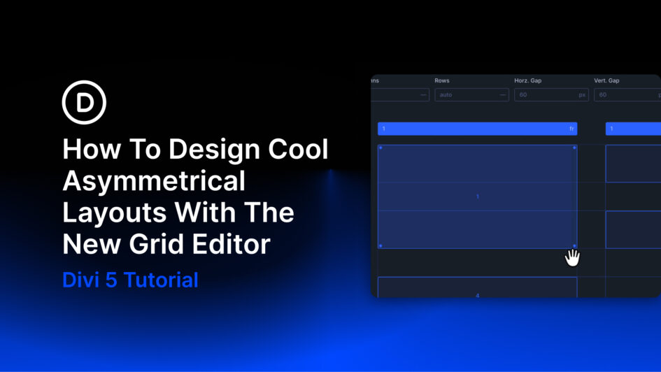
Marketing pages from Stripe, Linear, and Notion often use asymmetry to create movement, establish hierarchy, and give important content more visual weight. The layout may feel spontaneous, but the underlying structure is usually precise.
With Divi 5, that structure can begin with the CSS Grid system. The new Grid Editor adds a visual canvas where you can adjust tracks, gaps, placement, and spans while viewing the result directly in the Visual Builder.
In this post, we will use those tools to build four asymmetrical layouts: the Full-Left Banner, Z-Pattern Split, Weighted Corner, and Tetromino. Each design begins with a clear
Click here to continue reading this article.