Keeping a website consistent means carrying the same brand voice, design choices, and layout conventions into each new task. Repeating those instructions in every AI prompt adds work, especially when you are building several pages for the same client. Divi… Continue Reading →
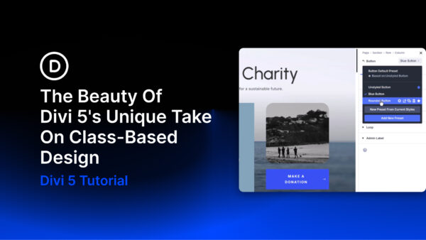
A growing website is easier to maintain when repeated styles share a common source. CSS classes support that approach by letting multiple elements use the same style rules. Change a shared rule, and the elements using it can update together…. Continue Reading →

Search, filters, and sorting help visitors find specific content in a blog, product catalog, or directory. With Divi 5, you can add these controls to a custom post loop using the Post Filter Module. In this tutorial, we’ll connect a… Continue Reading →

Every typography decision on a website is about relationships: how one text element reads against another, how clearly the hierarchy comes through, and how body text stays readable without competing with the elements around it. Static fonts give you a… Continue Reading →