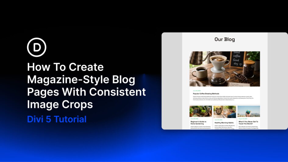
Most blog layouts fall apart at the images. One post has a tall portrait, the next has a wide landscape, and the third uses something almost square. The grid starts to look uneven, and the layout feels more like a plain list of posts than the magazine-style feed you had in mind.
Magazine layouts avoid that problem by placing every image inside a fixed frame. The photos can be different, but the crop system stays consistent.
In Divi 5, you can build the same kind of system visually. The Loop Builder repeats one post card across the feed, Aspect Ratio
Click here to continue reading this article.