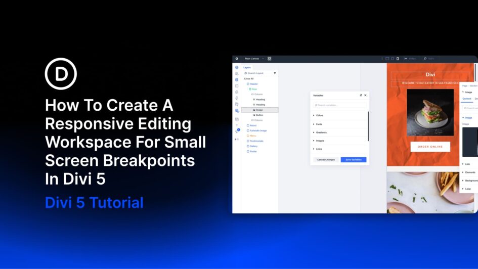
Switch the canvas to Phone view and the page becomes a narrow column, while the builder panels keep their existing size and position. Depending on your setup, the settings panel can take up as much space as the layout you’re editing.
For a quick check, that may be fine. You switch breakpoints from the top bar, scan the layout, and continue building. A dedicated responsive editing session involves more adjustments, though, and the panel arrangement that works for a full-width canvas may be less convenient at phone width.
Divi 5’s Workspaces let you rearrange the builder for this kind of
Click here to continue reading this article.