In web design, even the simplest decisions can multiply. What starts as a single design choice quickly expands into dozens of visual variations for interactions, backgrounds, borders, and more. Your build can become cluttered with mismatched values and manual tweaks without a consistent system.
Relative color syntax in CSS offers a smarter, more scalable approach. It lets you define visual variations based on a single source, keeping your design cohesive and easy to manage. Normally, this requires writing custom code. But with Divi 5, you can use these modern techniques visually, right from the start. Let’s take a closer look.
Common Color Management Problems
That one perfect brand color you pick can quickly multiply into dozens of variations scattered across your site. Here are some issues that contribute to this issue:
Managing Variations For One Color
You start with one base blue and quickly need dozens of variations. Your page builder’s color picker becomes a mess. Light blue, lighter blue, dark blue, darker blue, faded blue — each gets saved as a separate color.
Your brand blue spans twenty different shades across your site. Some sections use the original blue, others use a lighter version you made three weeks ago, and your buttons use that darker shade you made for better contrast.
None of these colors connects to the others. When your client wants purple instead of blue, you face updating every color by hand. You’ll spend hours clicking through modules. You hunt down each shade. You hope you don’t miss any.

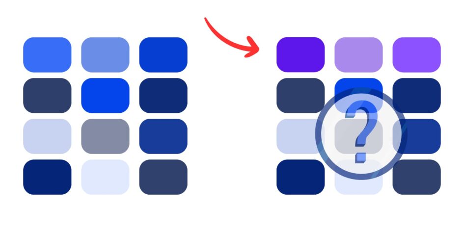
A collection of many similar blue shades on the left turns into scattered, unrelated purples on the right because updating them one by one is tedious and requires constant consistency. Even more, these color variations are usually eyeballed and don’t have any connection.
The Opacity Problem
Many page builders include transparency controls, which can be a nightmare for color consistency. You can create a perfect blue overlay with 60% opacity, but later, you need that same see-through red for a different section.
Your page builder doesn’t remember the exact mix, so you’re left eyeballing the opacity slider and trying to match what you made before.
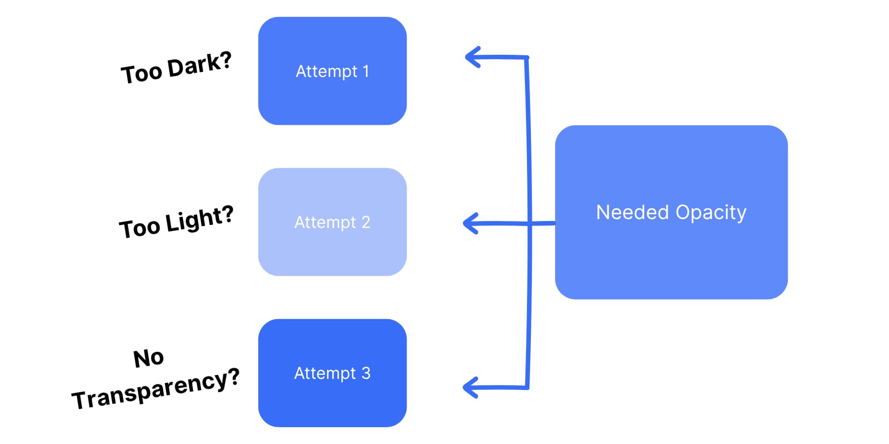
Attempts 1, 2, and 3 vary in shade and transparency because eyeballing doesn’t give precise results even with precise controls.
Some page builders let you save transparent colors. Others don’t. You end up with a bunch of similar-looking see-through blue.
They’re all slightly different. Your design loses consistency. You can’t reliably recreate the same transparent color across various modules. Each time you need transparency, you start from scratch. You guess at opacity values. You hope they match your existing design.
Creating Variables Manually
Most page builders offer some form of color saving, but it quickly becomes unmanageable. You save colors with generic names like “Yellow 1,” “Yellow 2,” and “Yellow Light.”
Six months later, you have no idea which yellow does what. Your saved color palette becomes a mess of similar-looking colors with meaningless names. Your color library grows without any organizational system. You have three different oranges that look nearly the same, but they serve various purposes.
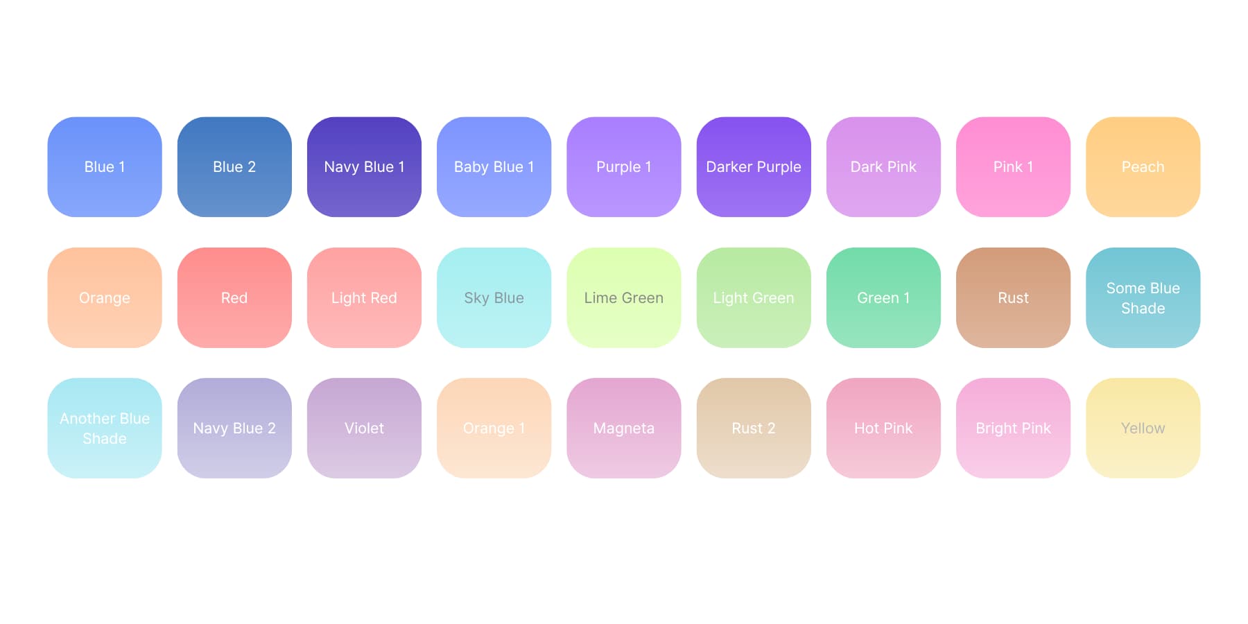
A grid of many color swatches with overlapping shades and inconsistent, unclear names contributes to a cluttered, confusing palette that’s difficult to organize or use effectively.
Team members add their color variations, creating duplicate shades with different names. Your brand orange exists as “Orange,” “Brand Orange,” “Primary Orange,” and “Orange Main.” Nobody knows which one to use.
Some developers try to solve this by writing custom CSS variables. This gives them better control over color relationships.
But now you’ve created a technical hurdle. Your non-tech team members can no longer update colors, and your clients cannot make simple color changes themselves. You become responsible for every minor color adjustment.
What Relative Colors Are In CSS (And Why You Need Them)
Relative colors solve your color problems. You pick one brand color. CSS makes all the versions you need. Light ones for backgrounds. Dark ones for borders. Clear ones for overlays. All from one starting color.
CSS functions as a dynamic color tool. You tell it, “Make this yellow lighter.” CSS does the work. Your red button needs to fade when hovering. CSS adds the transparency. Your blue header needs a darker border. CSS creates it right away.
Traditional workflows required more manual effort. Designers made color sets in Photoshop. Coders used tools like Sass. Website builders had to guess at matching colors. CSS now handles this automatically.
How CSS Creates Colors From Colors
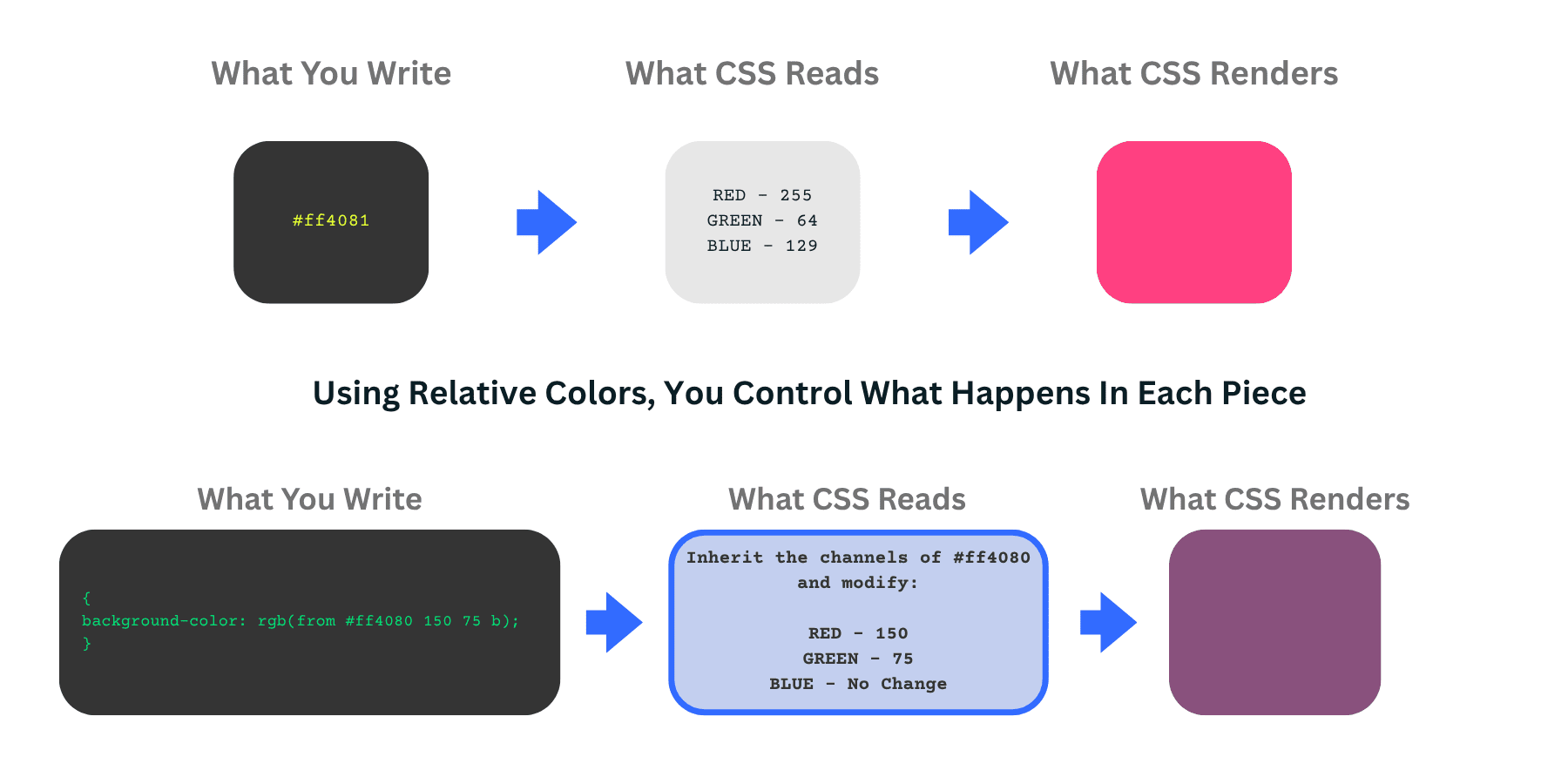
The word “from” tells CSS to use an existing color as its starting point. You give CSS a color, and it breaks that color into pieces it can use.
Your starting color becomes the base. CSS splits it into parts. Red amounts, green amounts, blue amounts. Or hue, brightness, and saturation if you prefer those controls.
You can start with any color format. Use a hex color like #e91e63. Tell CSS to work with it as HSL for easy brightness changes. Output it as RGB if your code needs that. CSS converts everything automatically.
The code follows a simple pattern. First, you say where to get the color from, and then you say what to change about it. You can keep everything the same but add transparency, or change the hue but keep the brightness. Both work the same way.
Breaking Colors Into Parts
Different color formats give you different tools. RGB lets you change red, green, and blue separately. HSL gives you hue, saturation, and lightness controls.
Here’s how it works. You write rgb(from #ff4081 r g b). CSS takes that pink hex code and splits it into red, green, and blue numbers. Then you can use those numbers however you want. The pattern stays the same: color-function(from your-color channel1 channel2 channel3).
So, instead of writing colors from scratch, you build on an existing color and change only the parts you want to change.
Each part gets converted to match what you picked. Converting that pink hex gives you r=255, g=64, b=129. Use them as-is or change them with calc().
You can mix and match channels, too. Want all red pixels to be the same? Use rgb(from var(–color) g g g). This takes the green value and uses it for red, green, and blue, creating a gray tone from your original color.
Browser Support & Other Considerations
Big sites can’t ignore visitors because they need to accommodate everyone. Safari’s old versions work differently. Chrome versions handle some things their own way. Firefox, it’s own. You will end up writing three different code versions for one color effect.
All this extra work takes time away from better things. You could improve the site’s functionality and add features people want.
Many developers use relative colors selectively. Internal tools and personal projects work well since you control the browser. Marketing sites and client work need more careful planning.
The technology works great where it is supported. The question is whether the extra complexity fits your project timeline and team or the client’s technical ability. But for most cases, it would be overkill and an overhead for most team members.
This is exactly why the Divi team stepped in. We saw web designers struggling with browser compatibility while missing out on powerful color tools. Our solution in Divi 5 takes the best parts of relative colors and wraps them in a system that works everywhere and requires no coding.
How Divi 5 Makes Relative Colors Easy
Now, you know the power of relative colors; however, you might have realized that it is not as easy to implement. Divi 5 took a different approach and built color flexibility right into its visual interface. But let’s find out what Divi is exactly.
What Is Divi?
Divi is the most popular WordPress page builder. It prioritizes visual design and gives you complete control over your design.
You can watch your changes happen live, adjust font sizes or line spacing, and immediately see the results on your page. You get access to 200+ modules that go anywhere you want them. Text blocks, headings, and content pieces work as a team. No rigid templates that squeeze your ideas into awkward shapes.
Here’s what makes Divi different: over 2000 ready-made layouts built for real businesses. These aren’t basic starter templates. Each design targets specific industries. You’ll find layouts that speak your audience’s language and match your business needs.
Skip The Blank Page Blues With Divi Quick Sites
Divi Quick Sites fixes that intimidating empty canvas that kills projects before they begin. You get professional starter websites with solid design that our design team builds using original images and artwork you won’t find anywhere else.
If you want something more personalized, Divi Quick Sites works with Divi AI to build custom layouts based on your business details. Describe your consulting firm or restaurant, and it produces relevant pages with industry-specific content.
These aren’t basic wireframes: you receive actual headlines, written content, and images that fit your business type. It even designs headers and footers, product pages, and blog post templates, among other things, for you.
You can set your brand fonts and colors from the start or let the AI choose them for you. The AI works within those guidelines. Afterward, everything stays completely editable, so you can adjust the typography until it matches your exact needs.
Complete Control Over Your Site’s Design, Now With AI
The Theme Builder puts you in charge of design across your entire website. Create custom headers that reflect your brand personality. Build blog layouts that keep readers engaged with long articles. Your 404 pages can stay on-brand with matching fonts and styling.
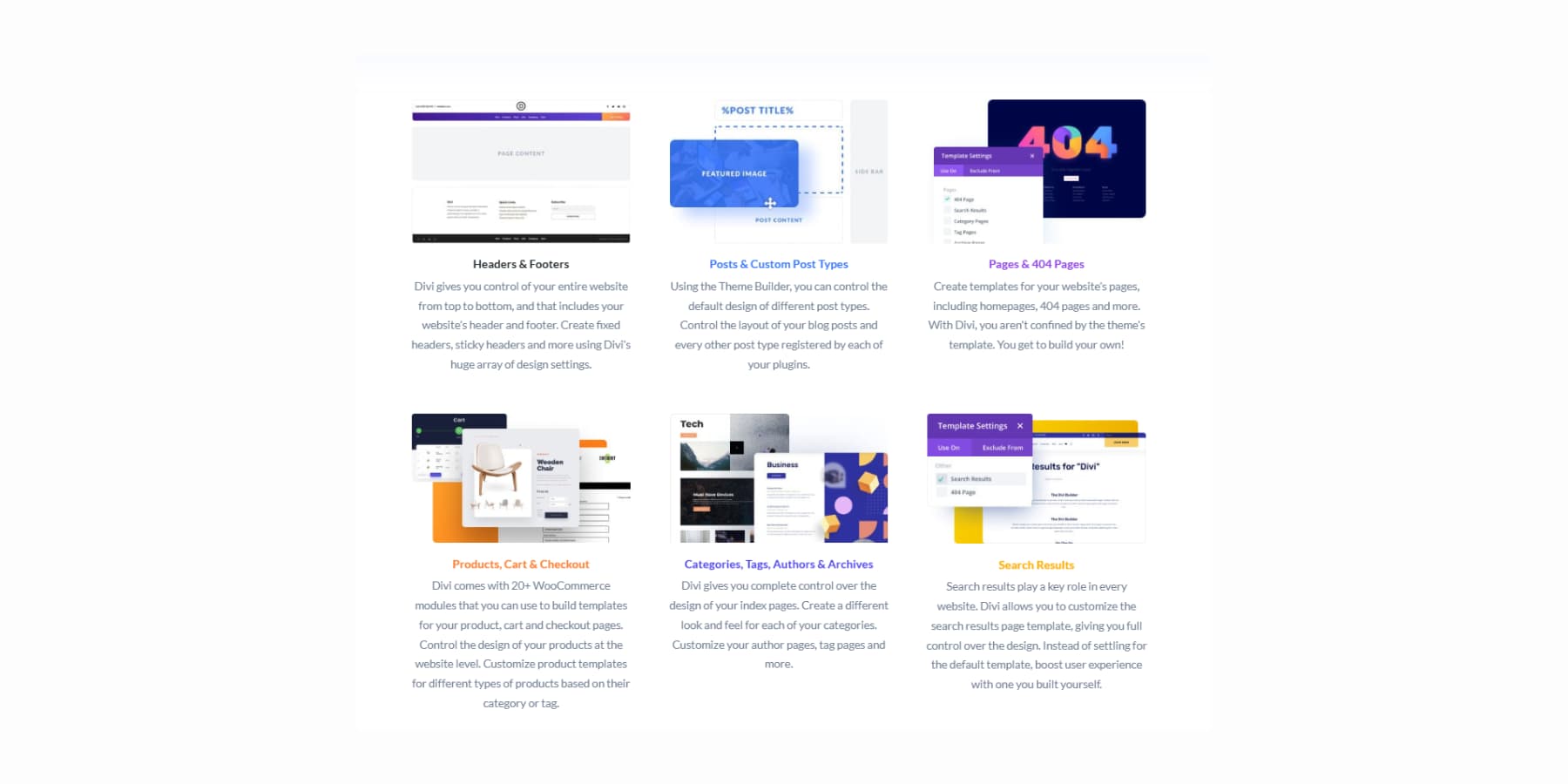
Divi AI, as mentioned earlier, puts AI right inside your design workflow. Create headlines that sound like you wrote them and product descriptions that capture your brand voice.
Photo editing can be done inside the builder. Tell the AI what changes you want in an image, and it handles the edits.
Need fresh images? It creates those, too.
Complete page sections that fit your business perfectly.
Plus code snippets when you need them.
Divi 5: The Next Evolution
Divi 5 enters alpha testing with a clear mission: to improve the performance of your web design process. We listened to real feedback about what slows you down and what would help you out.
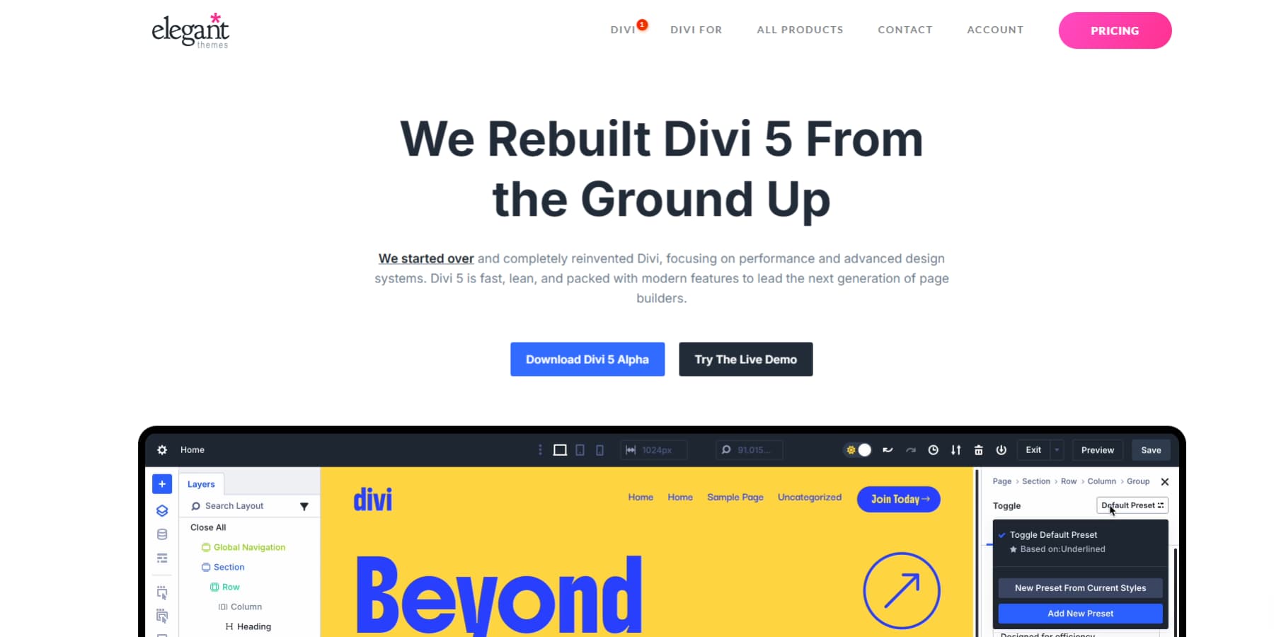
Everything you like about the current Divi stays put. We just made it work better. The interface looks cleaner. Pages load faster than before. Controls respond right when you click them.
We rebuilt the foundation using today’s web standards. This means fewer weird bugs and smoother performance overall.
You spend less time fighting the builder and more time designing. Your sites look more professional because consistency happens automatically. Clients get better websites because you can focus on their needs instead of technical problems.
The alpha version is ready to be used on new websites, though we don’t recommend converting your existing Divi 4 websites to Divi 5.
What’s New In Divi 5
Divi 5 brings major changes to how you build websites. The Public Alpha version works great for new projects right now. Our development teams ship new features every two weeks, with several major updates already released since alpha began.
Here are some key updates:
- The modern codebase speeds things up by loading only the modules you actually need, removing the code bloat that slowed down Divi 4.
- A Complete Flexbox layout system now includes new row templates, automatic vertical centering, content wrapping, and spacing distribution through visual controls.
- A brand-new Loop Builder that repeats modules, groups, or sections with dynamic content and supports nested loops for complex data structures.
- Relative colors with HSL provide dynamic color control based on hue, saturation, and lightness values.
- HTML-5-based system replaces shortcodes completely, which means fewer bugs and better WordPress compatibility.
- The Visual Builder interface got a complete makeover, with light and dark modes, dockable panels, tabbed windows, keyboard shortcuts, and an improved Layers View with breadcrumbs.
- Customizable responsive breakpoints replace Divi 4’s three fixed ones, giving you more control with canvas scaling to see exactly how designs look at different screen sizes.
- Module Groups work like versatile containers that bundle related elements together so you can style them as units or move them without losing relationships.
- Design Variables let you set colors, fonts, numbers, images, text, and URLs globally across your entire site.
- Option Group Presets save specific design properties like typography or shadows that work across different module types.
- Advanced CSS units now support clamp(), calc(), min(), and max() functions through the visual interface without writing code.
- The Interactions system creates popups, toggles, scroll effects, and mouse-movement effects without external plugins.
What’s Coming Up…
- WooCommerce modules rebuilt from scratch using Divi 5 architecture with full preset and variable compatibility.
- The Element Inspector will provide new debugging and development tools for advanced users.
- Likewise, Group Carousel Module can help you create a carousel composed of groups, then develop the content for each slide by utilizing Divi’s complete set of elements to design any style of carousel you want.
Building Palettes That Scale Themselves With Divi 5
Your color picker becomes a mess when you need dozens of your brand color variations. Divi 5 fixes this by connecting every shade to one base color. The steps below show you how to build a scalable and maintainable color system.
1. Setting Up Your Primary Color Foundation
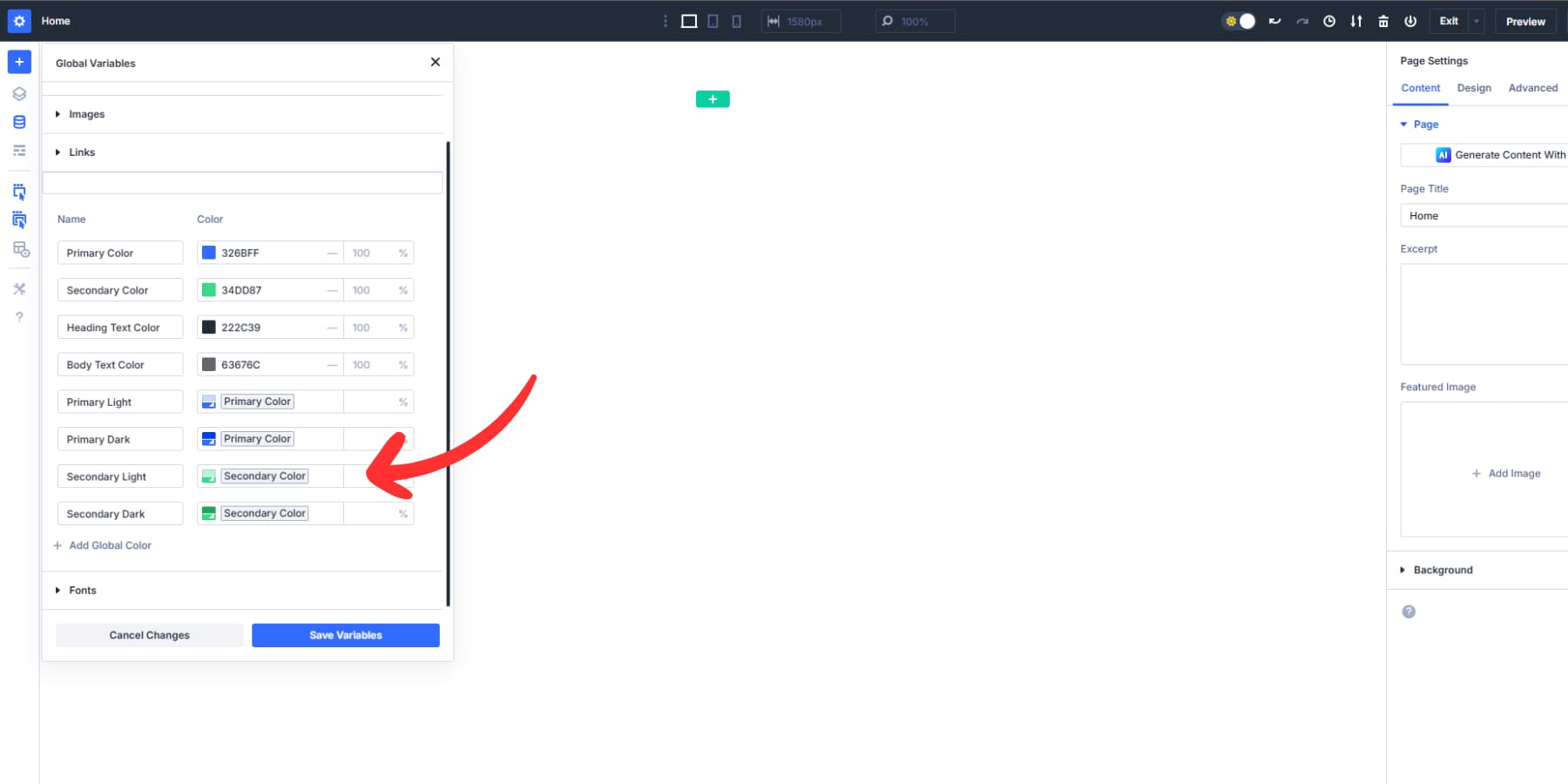
Open the Visual Builder and find the Variable Manager icon in the left sidebar. Click it to see your site’s color foundation. Divi 5 comes with preset color variables already waiting for you: Primary, Secondary, Heading, and Body colors.
You can’t delete these preset variables, but you can change their values. This works perfectly because these four colors handle most websites. Click on the Primary color variable and input your brand’s main color. This becomes the foundation for every other color variation on your site.
Your Primary color variable should reflect the most saturated version of your brand color. Think of it as the pure, undiluted version before you create lighter backgrounds or add transparency effects. This gives you the most range when building variations later.
The Secondary color works well for accents, buttons, or highlights that need to stand out from your primary brand color. Set your Heading color to something that reads well against your backgrounds. Body color typically stays dark gray or black for readability.
These four preset variables connect to Divi’s entire system. When you build modules, these colors appear as quick options. Change your Primary from blue to green here, and every module using that Primary variable updates instantly across your site.
Avoid creating excessive custom variables early on. Instead, start with these four presets. Most websites might need just these basic colors, with variations created through Divi 5’s relative color controls. But of course, if you need, you can add as many variables as you like.
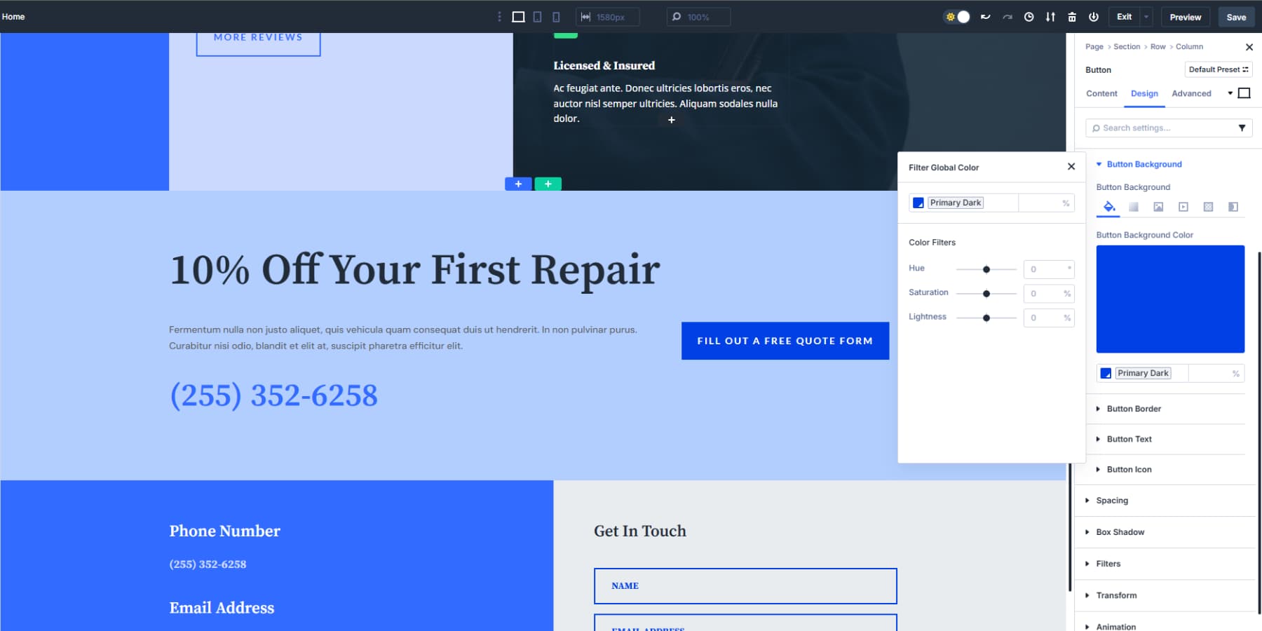
2. Creating Color Shades With HSL Controls
Now, add another color variable. This time, you’ll build a shade from your Primary color instead of setting a new base color. In the color picker, select your Primary color variable from the list.
Now you see three sliders: Hue, Saturation, and Lightness. These control how your base color changes.
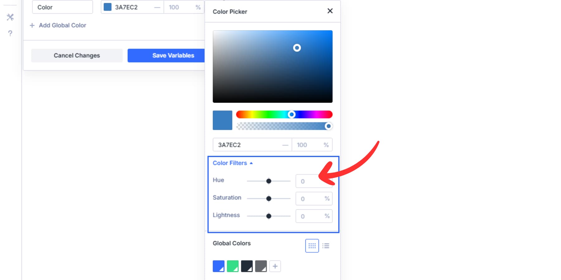
Hue moves around the color wheel from 0 to 360 degrees. Leave this alone when making shades of the same color. Saturation goes from 0% to 100% and controls how vivid your color looks. At 0%, any color becomes gray. At 100%, you get full intensity.
Lightness runs from 0% to 100%. This slider creates your actual shades. At 0, you get the pure form of your color. Move it up to 50% for lighter shades. Drop it to -20% for darker shades.
You can mix and match these HSL colors to build new colors and variations as needed.
Let’s create two variations of our primary color. Add a variable, and name your new shade something clear like “Primary Light” or “Primary Dark.” Repeat this process to create multiple shades. A typical setup uses your base Primary at 30% lightness for backgrounds and such, and Dark at -15% lightness.
You may also add such lighter and darker shades for your secondary color.
3. Building Nested Color Variables
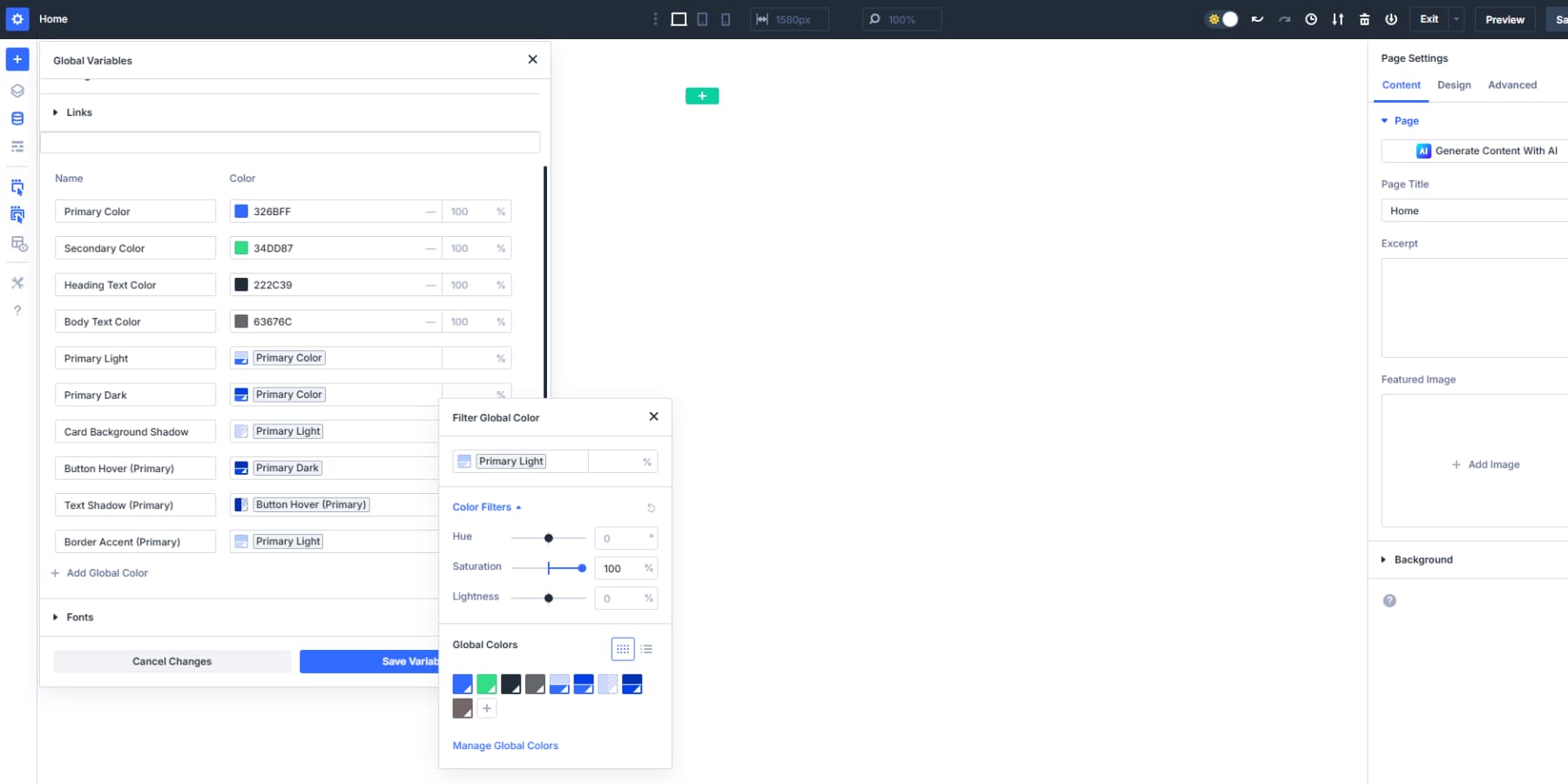
You made Primary Light and Primary Dark in step 2. Now you can build more colors from those shades.
Make a new variable called “Card Background Shadow”. Pick your Primary Light from the list. Drop opacity to 50%. This gives you a barely-there tint for card backgrounds. Next, create “Button Hover.” Pick Primary Dark. Drop Lightness another 10% to make it even darker. Now, your buttons can be a darker color when people hover over them.
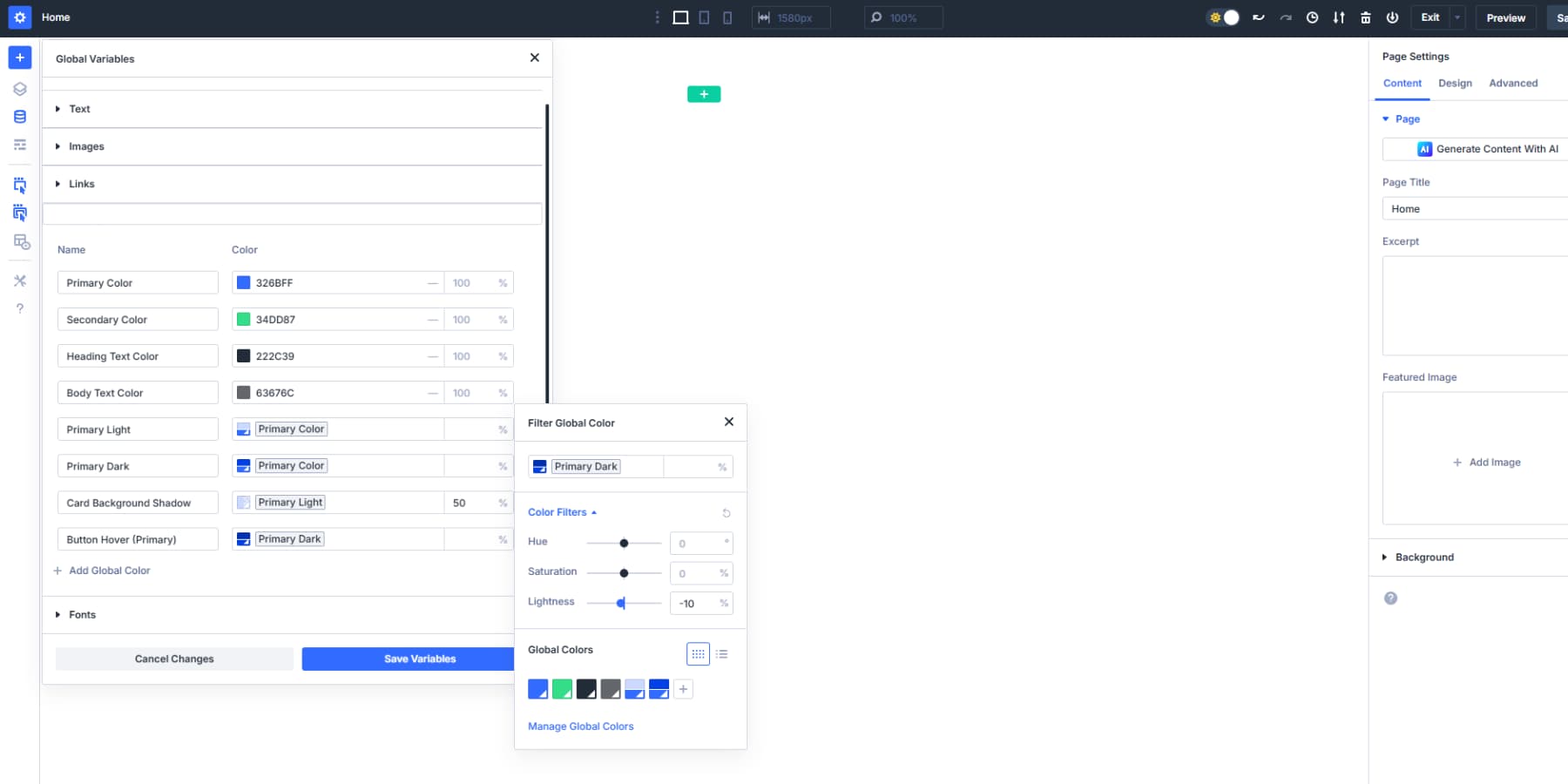
You can build custom colors from your shades too. Make “Text Shadow” by picking Button Hover. Set opacity to 15%. Now your text shadow connects to Button Hover, which connects to Primary Dark, which connects to Primary.
Try “Border Accent” from Primary Light. Bump Saturation to 100% to make it pop more. This gives you a bright border that still matches your brand. Each chain gets longer. All five colors trace back to one Primary choice.
Add similar shades for your secondary color for a nice selection of colors to select from.
4. Applying Relative Colors To Your Site
You built your color foundation and created all those shades. Now comes the practical part: implementing them across your website.
Open any module in the Visual Builder. Click on a color option for backgrounds, text, or borders. Your saved color variables appear right inside the color picker. You won’t need to remember the names or the hex codes.
Pick your Primary color for the main buttons. Choose Primary Light for section backgrounds. Use Primary Dark for borders and subtle accents like CTA buttons. Each selection connects back to your base color system.
Your color variables work everywhere: headers, footers, blog layouts, and product pages. Your team members and clients can pick colors without guessing. They see “Primary Light” instead of random hex codes in the picker. Clear names mean fewer mistakes and faster design work. Everyone knows which color serves what purpose.
This variable-based system prevents visual inconsistency. You won’t have to save dozens of similar blues or wonder which shade to use for hover effects. Your variables give you structure while keeping design flexibility.
5. Updating Colors When Needed
Your client decides they want midnight blue instead of just blue. With traditional color management, this means hours of sifting through modules and manually updating every shade or updating a bunch of global colors at once. With Divi 5’s relative colors, you change one variable, and everything else follows.
Your Primary Light backgrounds become light green. Primary Dark borders shift to dark green. Button hover colors adjust to a darker blue. All those nested relationships you built stay intact.
Your Card Background Shadow had a 15% opacity of Primary Light. It becomes 15% opacity of the new green Primary Light without you touching it. Your Text Shadow connects to Button Hover, which connects to Primary Dark, which connects to Primary.
The old way meant recreating color harmony from scratch every time. You preserve the relationships while changing the foundation, and your design stays balanced.
Your Colors, Your Rules
Inconsistent color use undermines good design. You’ve been saving random shades with meaningless names, hunting through modules for updates, and rebuilding palettes from scratch every time clients change their minds.
Divi 5’s relative colors end this workflow nightmare. Build once from a base color and automatically watch every variation update across your site. The system handles browser compatibility, maintains relationships, and keeps your color picker organized, so you won’t need to play with CSS.
Your next project deserves better color management. Download Divi 5 and see what organized design feels like.
The post Understanding Relative Colors In Web Design appeared first on Elegant Themes Blog.