You can build clean sections all day, but aligning elements across every screen size can start to feel more like trial and error than intentional design.
Flexbox fixes that. It gives you real control over how elements sit, stretch, shrink, and wrap inside a container, without constant adjusting of margins and padding. In this guide, we’ll break down how Flexbox works, how it simplifies layouts, and how to use it visually inside the Divi 5 without writing a single line of code.
What Is Flexbox
Flexbox, short for Flexible Box Layout, is a layout model that simplifies how elements align and space themselves inside a container. Rather than positioning each item manually using margins or fixed widths, Flexbox lets you define how those elements should behave depending on the space available.
Should elements grow to fill extra room? Shrink when space is tight? Should they wrap to the next line when they no longer fit? You make these choices through a set of properties you apply to the container and its children. This is how you decide how your layout should respond.
Let’s take practical examples to understand this. Say you have three buttons inside a horizontal row. With Flexbox, you can center all of them evenly inside the container:
Decide that the middle button should take up more space than the others:
Or you might want the buttons to automatically stack when the screen becomes narrower:
Flexbox makes all this possible with simple properties like justify-content, flex-wrap, and flex-grow.
In addition, it lets you control how items are spaced, aligned on different axes, and visually ordered, without changing their actual position in the builder. You can center content, push it to the top or bottom of the container, align one item differently from the rest, or even reverse the entire order across breakpoints.
You might think: Can’t I already do this with margins and padding?
You’re right. You can center elements manually or adjust their size with custom widths. However, those methods rely on positioning each item individually. You’re adjusting each element one at a time, for each screen size.
Flexbox shifts that process entirely. Instead of treating each element separately, it lets you define layout rules at the container level once. You tell the container how its children should behave in different scenarios, and it adjusts them as needed.
This approach makes layouts more consistent, easier to manage, and more flexible as designs evolve, especially when screen sizes change or new modules are added.
How Flex Direction Affects Alignment
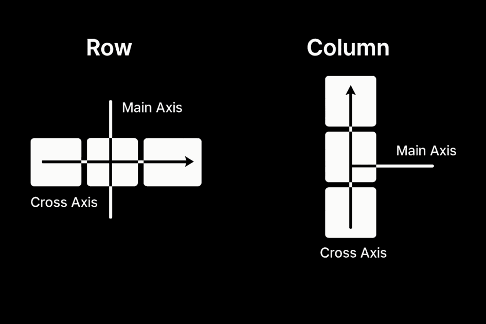
One of the first choices you make in Flexbox is the direction in which the elements should flow, whether in a row or a column. The flex-direction property sets this and defines how items align, wrap, and space themselves inside the container.
Let’s understand this better because common properties like justify-content and align-content depend entirely on which direction is set. They don’t work off the browser’s default layout, but the axes created by Flexbox: the main axis and the cross axis. The main axis follows the direction you set with flex-direction: horizontal for rows, vertical for columns. The cross axis goes the other way: vertical for rows, horizontal for columns.
So, the main axis runs left to right when the direction is set to row. That means justify-content moves elements across the row, and align-items controls how they align vertically within that row.
And when you switch the direction to column, the entire alignment logic flips. The main axis now runs top to bottom, which means justify-content aligns items vertically, and align-items adjusts their position from left to right.
It can feel slightly confusing at first, but once you see how the main and cross axes respond to direction, it clicks. You’ll start spotting patterns, and layout decisions will feel more intuitive. There’s also a quick reference table below if you want to double-check things while practicing.
Syntax & Common Flexbox Properties
Switch a container’s display property from Block to Flex to activate Flexbox. When you do this, the browser starts treating inner elements such as rows, buttons, cards, or icons as flex items.
.container {
display: flex;
}
From there, you use different Flexbox properties to control behavior. For example, justify-content decides how items are spaced along the main axis (this is set to horizontal by default, flex-direction: row). Use flex-start to align items to the left, flex-end to push them right, center to center them, or space-between and space-around to spread them out evenly.
By default, Flexbox tries to fit all items on one line. If there are too many, they’ll shrink to fit based on their flex-shrink settings, and if they can’t shrink enough, they may overflow the container. To prevent this, turn on flex-wrap so items move onto a new line instead of cramming into one.
You can already think of many use cases where these two properties can solve layout issues. But there are many more, and each one gives you specific control over size, order, alignment, and spacing.
| Property | Used On | What It Does |
|---|---|---|
| display: flex | Container | Enables flex layout on the container and activates Flexbox behavior. |
| flex-direction | Container | Defines the direction of items: row (default), row-reverse, column, or column-reverse. |
| flex-wrap | Container | Allows items to wrap onto multiple lines: nowrap (default), wrap, wrap-reverse. |
| justify-content | Container | Aligns items along the main axis: flex-start, center, space-between, space-around, space-evenly, flex-end. |
| align-items | Container | Aligns items along the cross axis: stretch (default), flex-start, center, baseline, flex-end. |
| align-content | Container | Aligns multiple rows of content when there is extra cross-axis space: stretch, flex-start, center, space-between, space-around, flex-end. |
| flex | Item | Shorthand for setting flex-grow, flex-shrink, and flex-basis together. |
| flex-grow | Item | Controls how much the item will grow relative to others. |
| flex-shrink | Item | Controls how much the item will shrink relative to others. |
| flex-basis | Item | Sets the initial size of the item before growing or shrinking. |
| align-self | Item | Overrides align-items for a specific item. |
| order | Item | Changes the order in which the item appears within the flex container. |
If you’re curious to see how these actually work in a playful, hands-on way, try out Flexbox Froggy. It’s a fun little game where you apply real Flexbox code to move frogs around a pond. Along the way, you stop guessing and start recognizing exactly what each property does.
Why Use Flexbox
By now, you’ve seen how Flexbox changes how layouts respond to space. But the real value comes from what that shift allows you to do more easily. Flexbox turns stubborn layout challenges into simple, reusable patterns.
- Simplified Alignment: Properties like justify-content and align-items center or space items without relying on margin tweaks or helper classes.
- Responsive By Default: Items naturally grow, shrink, or wrap depending on their space. This results in cleaner layouts that adapt without added breakpoints.
- Automatic Spacing & Sizing: You control how elements share space with properties like flex-grow, flex-shrink, and flex-basis, making the layout fluid instead of fixed.
- Reordering Without Changing HTML: You can change the visual order of elements without touching the HTML. The structure stays clean, while the layout adjusts for different screens.
- Fewer Layout Hacks: You no longer need floats, clearfixes, or height-matching scripts. Flexbox replaces those with modern, reliable options.
And because it’s supported across all major browsers, Flexbox is not only efficient but also dependable. This makes it a modern, more reliable choice for real-world projects.
Why Flexbox Is Often Better Than Grid
Grid is another popular layout system, like Flexbox. However, both are built for different use cases.
Grid, for instance, is designed for two-dimensional layouts where you need control over both rows and columns. Product showcases, image galleries, and magazine-style editorial layouts are grid examples, as they rely on a tightly aligned structure across both axes.
You start by defining the grid: how many rows and columns there are, and how wide or tall each should be. Then you place each item into that structure.

This is a Grid layout. Items are aligned on both axes: rows and columns, with fixed spacing and proportions.
But not every layout needs that level of planning.
Most of the time, UI sections flow in a single direction. Rows of cards, icon-plus-text blocks, and navigation links follow one axis, not two. That’s exactly where Flexbox fits in.
In a Flexbox layout, cards are aligned in one direction (row or column) and then wrapped and spaced based on container rules.
You don’t have to map out the entire layout in advance. You simply tell the container how items should behave along a single axis, and Flexbox handles it.
So, unless you’re designing something that truly depends on a rigid grid, Flexbox will often be the faster, simpler, and more flexible choice.
Flexbox In Divi 5
Everything we’ve learned so far about Flexbox is great, but writing custom CSS for every layout tweak isn’t what you want to do, especially if you’ve built your site using a visual builder like Divi.
That’s why Divi 5 now includes built-in Flexbox controls. You no longer need to switch tabs or add CSS manually. All of this, and even advanced layout behaviors, is now built into the visual builder, minus the coding and an overwhelming backend.
Subscribe To Our Youtube Channel
Long story short, no need to remember syntax or property names, just select what you want from the interface. Click on any section, row, or column, head to the Design tab, and under Layout > Layout Style, make sure to use Flex.
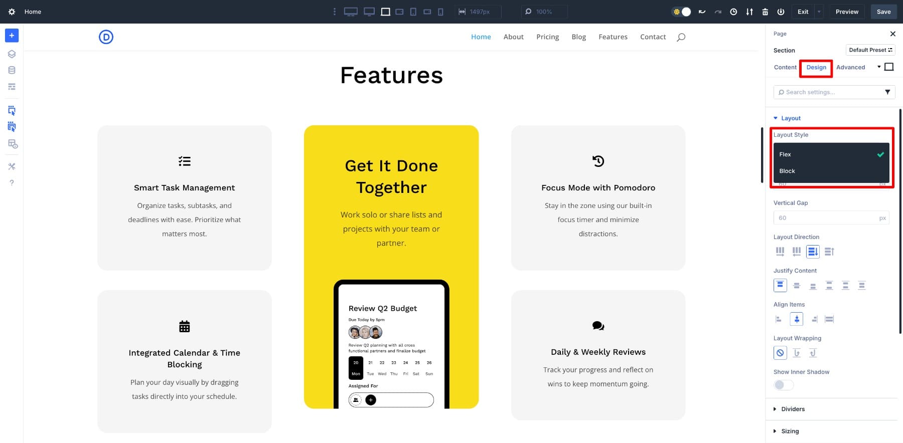
This opens a new set of layout controls. These are the core Flexbox properties you’d usually write in CSS, but now as clickable options. You can test changes live and see how your content reacts.
So even if you’ve never written a single line of Flexbox code, you won’t miss out on anything. Divi 5 gives you the same layout control visually with the same level of control, but a lot more ease.
Learn Everything About Divi 5’s Flexbox System
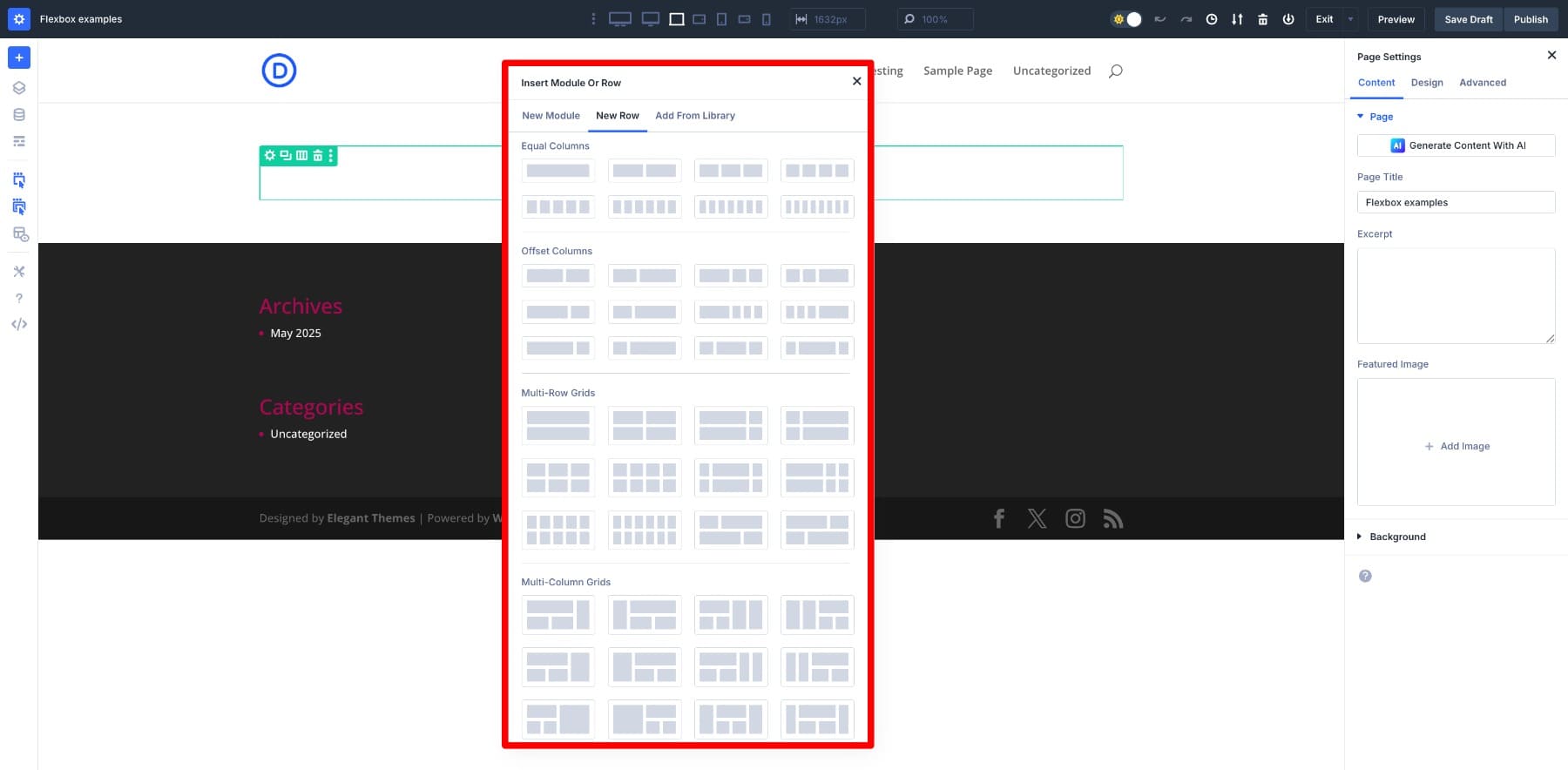
New Row Structures
Why Divi when other web builders also have it? While many web builders offer Flexbox as a layout option, Divi 5 approaches it differently. This isn’t a feature layered on top of an existing system; it’s now the core of how the builder works.
The entire layout engine has been rebuilt from the ground up with Flexbox at its foundation. As a result, the layout behavior feels more consistent and predictable because it follows an intentionally designed layout logic.
For example, when you add a new section or row in Divi 5, you’ll immediately notice something different. New structures. Each now runs on Flexbox by default, which means alignment, spacing, and responsiveness are handled more intelligently from the start.
You won’t need to turn on Flex for new design elements you add. And when you do, while editing an older layout, the alignment and spacing tools become instantly easier to manage.
You can also change how columns are arranged inside a row using Change Column Structure.
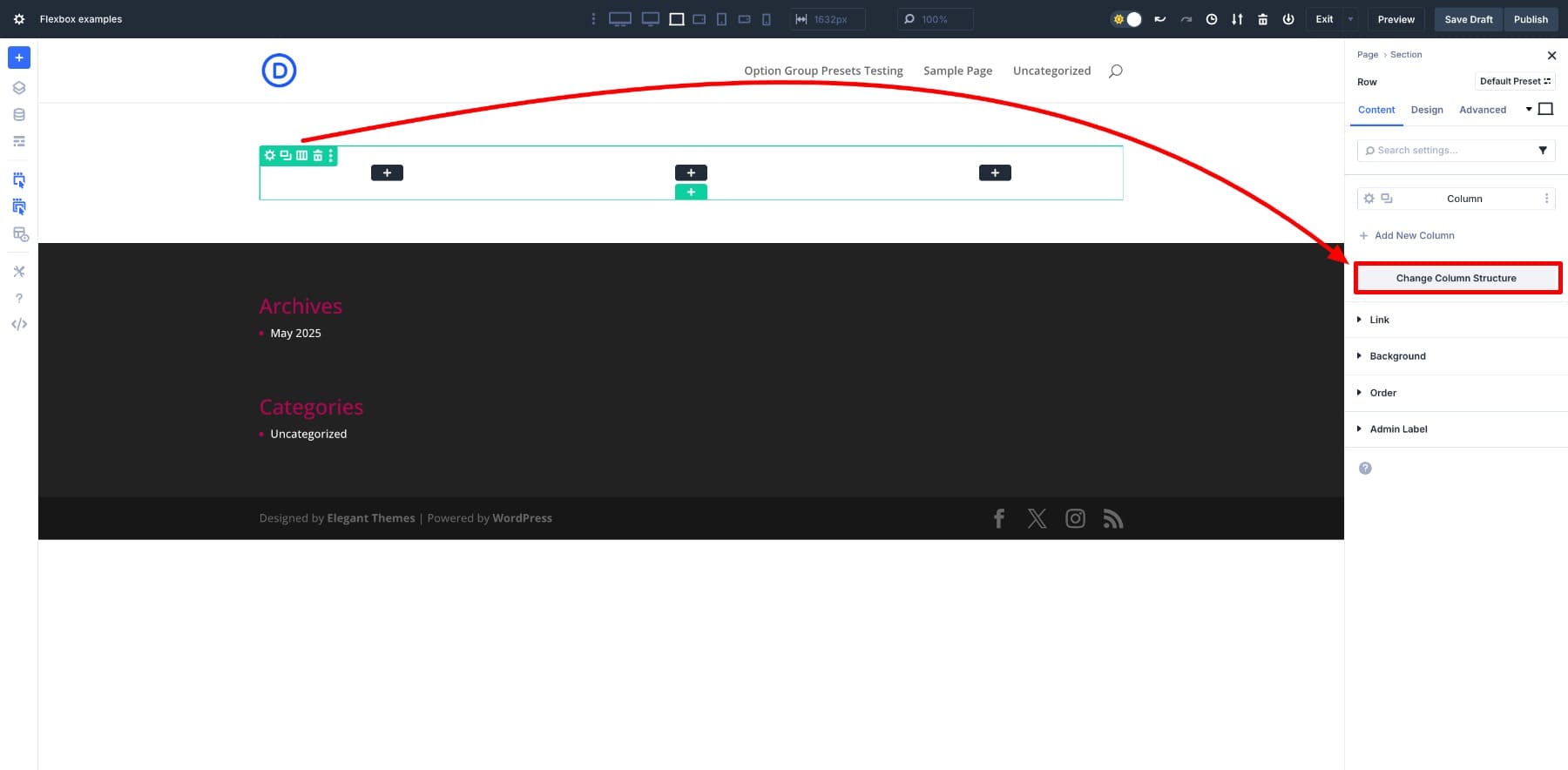
This opens a panel where you can select a new column structure. The layout updates immediately, with Flexbox automatically adjusting spacing and alignment.
Try adding a few different row types and resizing the screen. You’ll see how everything shifts and adapts without breaking down. That’s the strength of Flexbox baked into the builder, making Divi 5 a more reliable and modern option.
How Flexbox Works In Divi 5
If you’re getting started, here’s a quick walkthrough to help you feel confident when using Flexbox in Divi 5.
Layout Controls
When you switch a section, row, or column to Flex layout, a new set of layout controls appears in the Design > Layout settings. These give you visual Flexbox control right alongside your usual options.
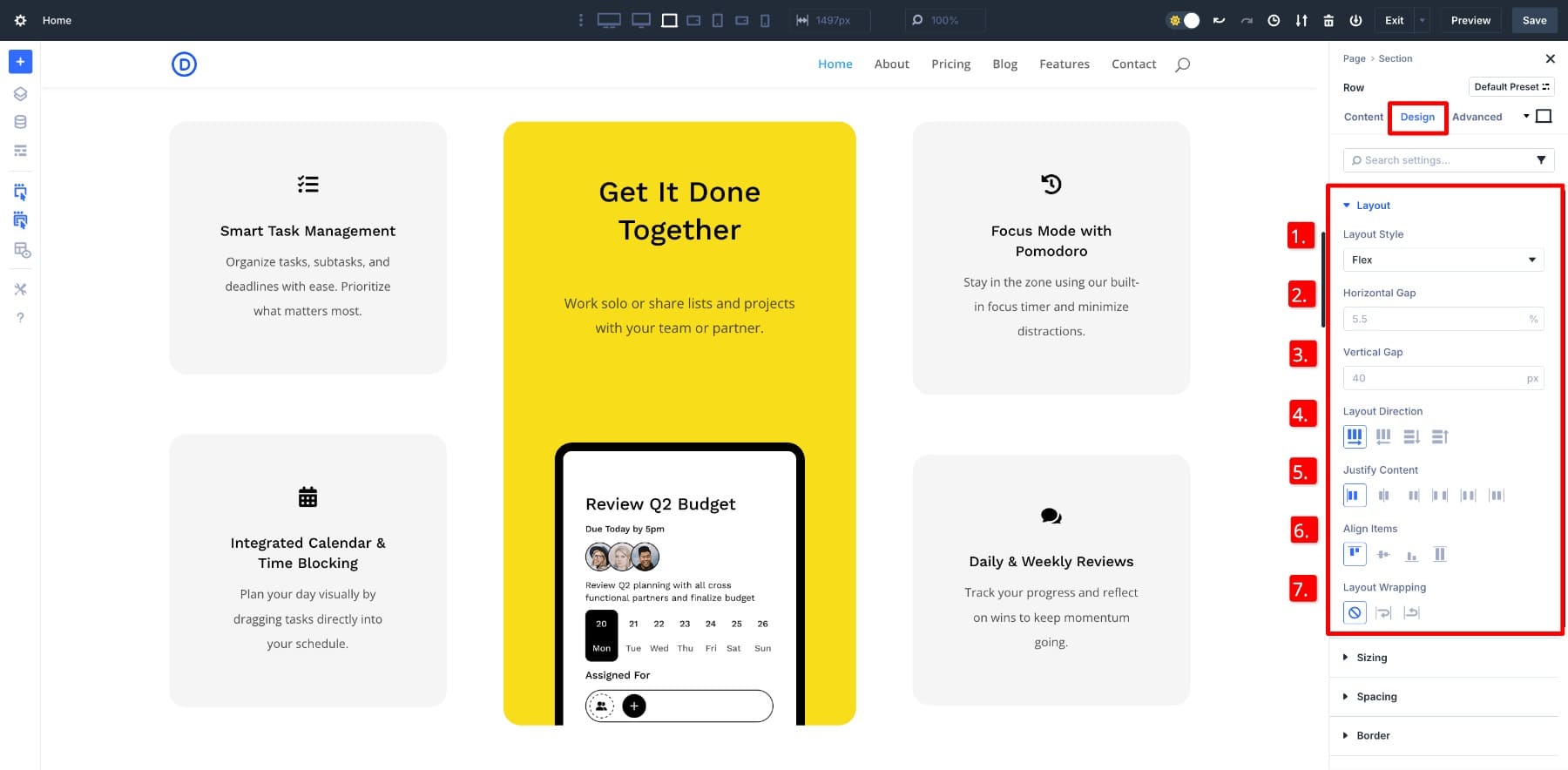
- (1) Layout Style: This is where you activate Flex. Once set, other Flex-specific options like direction, alignment, and spacing become visible.
- (2) Horizontal Gap: Adds space between items from left to right.
- (3) Vertical Gap: Sets the space between stacked elements when using column layouts.
- (4) Layout Direction: Changes the flow, row, column, or reversed directions, so items can align side by side or top to bottom.
- (5) Justify Content: Aligns items along the main axis. You can center them, push them to one side, or spread them out.
- (6) Align Items: Aligns items along the cross axis, which is helpful when arranging items vertically within a horizontal row.
- (7) Layout Wrapping: This lets items move to the next line when space runs out. Helpful while building layouts that respond to screen size instead of breaking.
Let’s say you have a brand bar with logos and want them to be bigger. With Flex direction set to Row and Layout Wrapping turned on, they’ll automatically flow into two rows when there’s no space.
Aligning elements in two rows is now easy without media queries or a manual workaround.
Column Controls & Sizing
Once inside a Flex-enabled row, each column has a new setting under Design > Sizing called Column Class. This determines how much space a column takes up based on its content and surroundings.
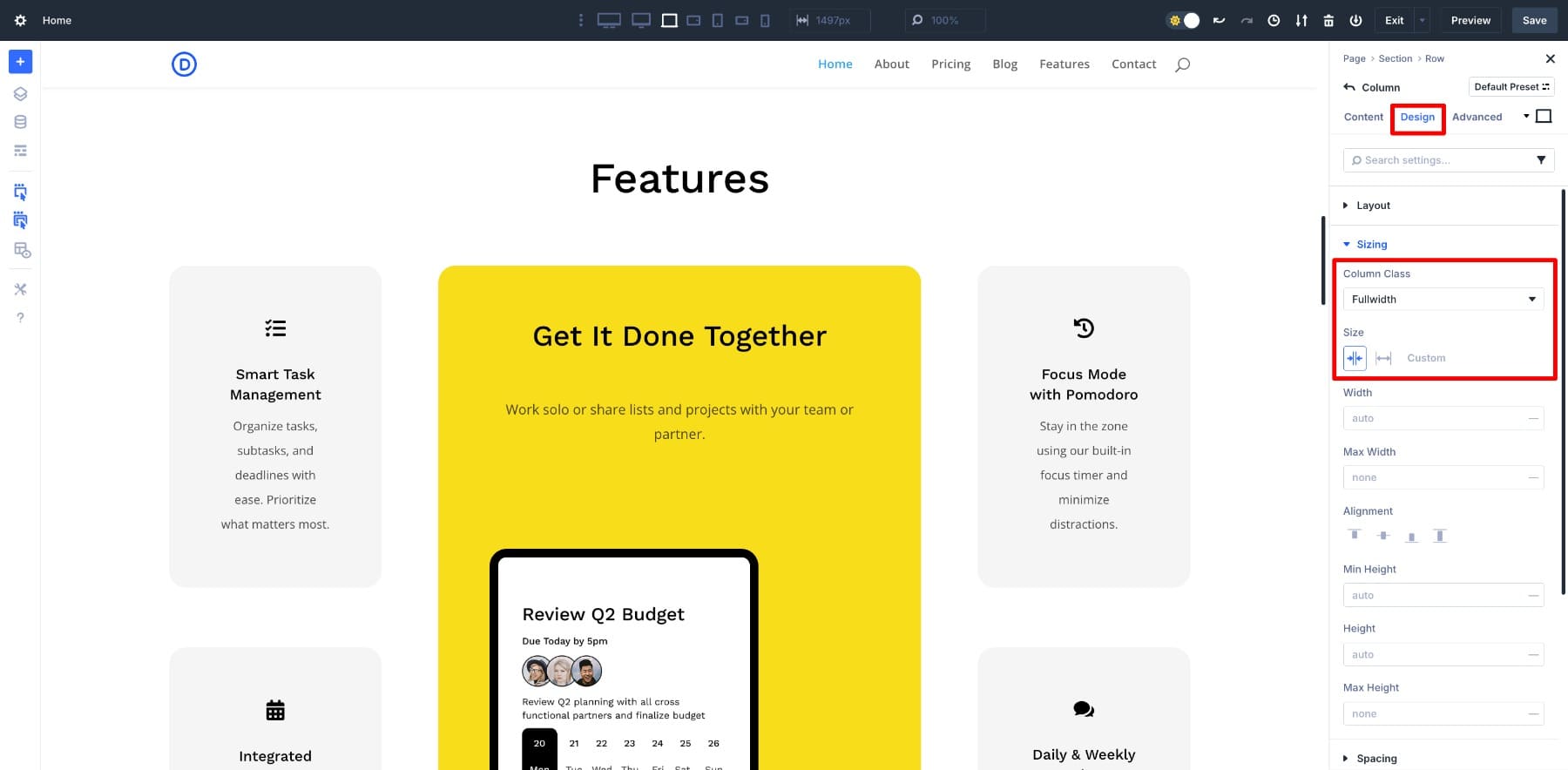
You can pick between Shrink to Fit (which makes the column only as wide as its content) or Grow to Fill (which stretches the column to take up extra space).
For example, if you want a text column to feel more prominent and have card elements that hug their content, you’d set the cards to Shrink to Fit and the text to Grow to Fill.
Order Controls
Another powerful, but often overlooked, tool is the Order setting under the Content tab. This lets you visually reorder columns and modules without changing the layout structure in Wireframe or Layers view.
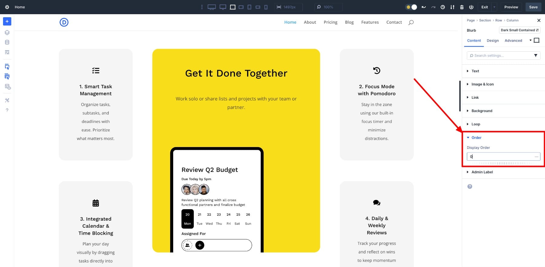
Say you want a particular module to appear first on mobile but second on desktop. You can assign different order values at each breakpoint.
Practical Use Cases Of Flexbox
Let’s look at a few more Flexbox use cases that are now simplified with Divi 5.
1. Vertically Align Anything With Flex
For a long time, vertical alignment was one of web design’s most annoying layout problems. You’d try padding tricks, absolute positioning, manual margins, and whatnot only to end up with something that looked fine on desktops but was broken on smaller screens.
With Divi 5, that headache is gone. Now, if you want to center content vertically inside a section, you just set the Align Items to center.
That’s it. The layout adjusts automatically across breakpoints, and your content always stays in the sweet spot. What used to take CSS gymnastics is now just a couple of clicks inside the builder.
2. Equalize Card Heights Automatically
You’ve probably run into this problem before. You create a row of cards, such as a blurb section, and everything looks fine until one item has more text than the others. Suddenly, your layout feels uneven. Some columns stretch taller, others stay short, and the design loses balance.
That manual cleanup is no longer needed. When you switch a row or section to Flex, Divi applies default settings that treat each column as a flex item. This makes them automatically stretch to match each other’s height within the same row, regardless of the content inside.
It also stays responsive. On smaller screens, columns wrap into new rows without needing extra tweaks, and the equal height behavior continues to apply.
3. Wrap Buttons Automatically Across Breakpoints
Keeping a row of buttons neat and readable across different screen sizes can be a pain. You usually end up adding new rows or manually adjusting the layout for each breakpoint. But with Divi 5, that’s no longer necessary.
Turn on the Flex layout and enable Layout Wrapping in the Laptop view. That’s it. The buttons will automatically wrap into multiple lines on smaller screens without breaking the layout.
The buttons keep their spacing and alignment on larger screens and stack naturally on tablets and phones. You can even fine-tune their alignment using justify-content, and control spacing between them using Gap, so everything looks clean and intentional at every size.
Divi + Flexbox Just Makes Sense
You’ve seen how Flexbox works, how Divi 5 makes it visual, and how common layout headaches now take seconds instead of hours. Divi 5 doesn’t just support Flexbox — it’s built around it. Every section, row, and column is ready to behave as you’d expect without custom CSS.
Flexbox isn’t just an option if you’re designing with Divi 5. It’s the smarter default. Cleaner layouts, fewer workarounds, and responsive control baked right into the builder. That’s the shift, and that’s something that prepares you for the future of web design.
The post What Is Flexbox (And Why You Should Use It) appeared first on Elegant Themes Blog.
Click here to continue reading this article.