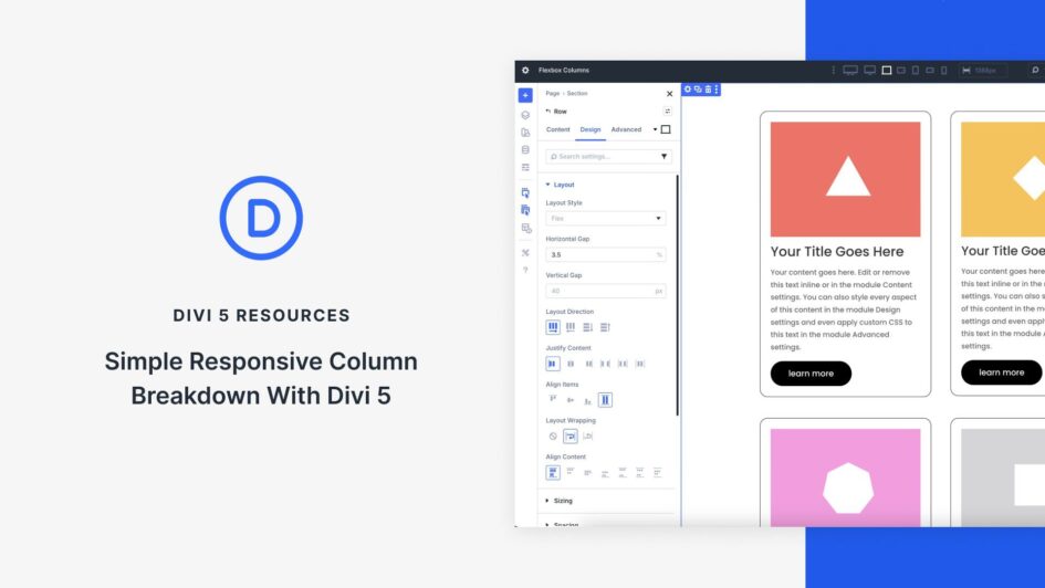
At its core, Flexbox is a powerful CSS layout model that gives you precise control over how items flow and align within a container. Divi 5 integrates Flexbox directly into the Visual Builder, turning every element into a flexible container. Flexbox isn’t just a minor update; it’s a shift that enables you to create responsive sites with just a few clicks.
In this post, you’ll learn how to harness Divi 5’s Flexbox system to build simple, fully responsive layouts that adapt beautifully to every screen size. We’ll walk through setup, key features, and provide a hands-on tutorial using Divi’s new